While it may seem superficial, font choice makes a huge impact in how the written word is interpreted. For example, many brands began to use sans serif (meaning without the feet on the edges of letters) typefaces in the 19th century, because it evoked modernism in terms of efficiency, structure, and simplicity. This isn’t always the case, but it goes to show that the font you choose for your resume or email might say more about you than mere aesthetics. Let’s learn more about the stories behind some of the most famous fonts.
Spencerian Script
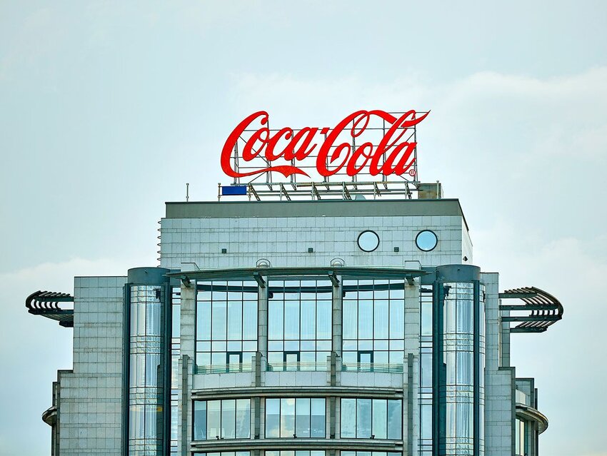
This script is easily recognized from the classic Coca-Cola and Ford logos; this style of script handwriting was also taught in schools in the United States in the second half of the 19th century. While many brands were shifting to sans serif fonts around this time, this style of handwriting spoke to the classic American tradition of these brands.
Centra Font
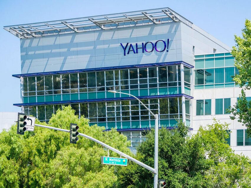
Yahoo! uses the Centra font, designed by Josh Finklea in 2017. The font is “a study in utility and restraint,” an example of modern typography’s most popular genres, the geometric sans. While other examples, such as Futura and Helvetica, maintain a strict adherence to formal geometric structure, the designer of Centra wanted to emphasize texture and readability over conceptual rationale, which makes it a more fun, light-hearted take on this strict genre of fonts.
Helvetica
Helvetica is the modern graphic designer’s darling, beloved enough to be the subject of an eponymous 2007 documentary. This font is seen virtually everywhere, including the New York City Subway system. It was originally called Neue Haas Grotesk, but named Helvetica in 1960 to make it easier to sell abroad (it means “Swiss” in Latin, an homage to its home country). It’s meant to be boring, a carrier for neutral and versatile design, which speaks to its popularity. Despite this, it isn’t an original font — it’s based on an 1896 typeface called Akzidenz-Grotesk, known as “Standard” in the U.S.
Avant Garde

Spot this font in the Adidas logo. It’s a display font, meant to be used for headlines and short text. It was designed by Herb Lubalin and Tom Carnase around 1968, and became a classic in 1970s advertising design. While the font wasn’t technically designed until the late ’60s, it’s worth noting that the Adidas logo utilized a similar aesthetic since the late 1940s.
Trajan
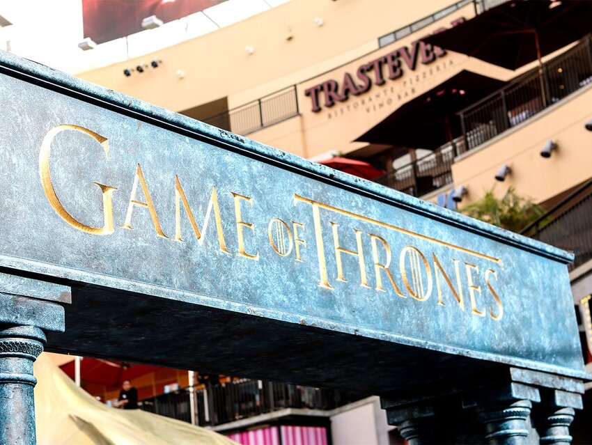
This font, created in 1989 by designer Carol Twomby, is featured in the Game of Thrones HBO logo. It’s the epitome of a classically styled typeface, inspired by the imperial Roman letter forms chiseled into stone as early as 43 BCE. The name itself comes from the lettering on the historic Trajan’s Column in Rome. When it first came out, it was touted by designers as the “new big thing,” with historian James Mosley saying it was the “new Helvetica.” It never took off like that, but it’s still seen on many corporate logos.
Times New Roman

One of the most widely used fonts, Times New Roman, is a default logo in every word processor. It got its name from the Times of London, a British newspaper, in 1929. Because it was used in a daily newspaper, it became popular among printers. In the decades since, it’s cemented itself as the default. But because of this, it can be read as a lazy choice — as one typography blog put it, “it connotes apathy. It says ‘I submitted to the font of least resistance.’”
Comic Sans
Perhaps the most polarizing of font choices, Comic Sans was designed by Vincent Connare to appear in the failed “Microsoft Bob” interface for Windows. This program was designed to help users interact with their first PC, but it never took off. Inspired by comic books, it was supposed to appear in the program, but wasn’t included in time. While many designers consider it to be a joke, the font does have a redeeming quality — it is recommended by the British Dyslexia Association as being easier for dyslexic people to read.
Featured image credit: kyoshino/ iStock